


 https://innovation.luskin.ucla.edu/wp-content/uploads/2026/06/TCC-news-story-2026.png
600
1200
angela wu
https://innovation.luskin.ucla.edu/wp-content/uploads/2024/07/web-headers-2024-07.png
angela wu2026-07-07 09:00:212026-07-07 10:01:33Climate communities are healthy communities
https://innovation.luskin.ucla.edu/wp-content/uploads/2026/06/TCC-news-story-2026.png
600
1200
angela wu
https://innovation.luskin.ucla.edu/wp-content/uploads/2024/07/web-headers-2024-07.png
angela wu2026-07-07 09:00:212026-07-07 10:01:33Climate communities are healthy communitiesElement: Separator/Whitespace
Creates a delimiter/whitespace to separate elements
Settings
Styling
- Horizontal Ruler Styling
Here you can set the styling and size of the HR element
-
Default
-
Big Top and Bottom Margins
-
Fullwidth Separator
- Section Top Shadow
Display a small styling shadow at the top of the section
- Section Top Shadow
-
Whitespace
- Height
How much whitespace do you need?
- Height
-
Short Separator
- Position
Set the position of the short ruler
- Position
-
Custom
- Icon
Should an icon be displayed at the center?
- Icon
Select an icon below
- Position
Set the position of the short ruler
- Border
- Width
Enter a custom width.
- Top Margin in px
- Bottom Margin in px
- Custom Border Color
Leave empty for default theme color
- Custom Icon Color
Leave empty for default theme color
- Icon
-
Element: Tabs
Creates a tabbed content area
Tabs Settings
Content
- Title
This is the small title at the top of your notification. - Message
This is the text that appears in your notification. - Button Icon
Should an icon be displayed at the left side of the button - Button Icon
Select an icon for your button below - Close Button
Display a button that closes the notification when clicked.
Styling › Size
Styling › Colors
-
- Custom Color
- Custom Background Color
Select a custom background color for your notification here - Custom Font Color
Select a custom font color for your notification here
- Custom Background Color
- Gradient Color
- Background Gradient Direction
Define the gradient direction for background of the element - Gradient Color 1
Select the first color for the gradient. - Gradient Color 2
Select the second color for the gradient. - Gradient Color 3
Select an optional third color for the gradient. - Custom Font Color
Select a custom font color for your notification here
- Background Gradient Direction
- Custom Color
Styling › Border
Styling › Box Shadow
Advanced › Effects
- Sonar/Pulsate Effect
Select a sonar/pulsate effect for the element. - Sonar Shadow Color
Select the color for the sonar shadow. - Sonar effect duration
Select approx. length of one effect, larger value slows down - Expand Scale
Select the expand value for the sonar effect - Element Opacity
Select the opacity of the element when expanding
Individual Tab Settings
Content
- Tab Title
Enter the tab title here (Better keep it short) - Tab Icon
Should an icon be displayed at the left side of the tab title? - Tab Content
Enter some content here
Tab 1
Lorem ipsum dolor sit amet, consectetur adipiscing elit, sed do eiusmod tempor incididunt ut labore et dolore magna aliqua. Ut enim ad minim veniam, quis nostrud exercitation ullamco laboris nisi ut aliquip ex ea commodo consequat. Duis aute irure dolor in reprehenderit in voluptate velit esse cillum dolore eu fugiat nulla pariatur. Excepteur sint occaecat cupidatat non proident, sunt in culpa qui officia deserunt mollit anim id est laborum.
Tab 2
Element: Accordion
Creates toggles or accordions (can be used for FAQ)
Accordion Settings
Content › Toggles
- Add/Edit Toggles
Here you can add, remove and edit the toggles you want to display. - Use as FAQ Page (SEO improvement)
Select if content is used as FAQ and add schema.org markup to support Google Search.
Content › Behavior
- Initial Open
Enter the Number of the Accordion Item that should be open initially. Set to Zero if all should be close on page load - Behavior
Should only one toggle be active at a time and the others be hidden or can multiple toggles be open at the same time? - Sorting
Display the toggle sorting menu? (You also need to add a number of tags to each toggle to make sorting possible)
Styling › Toggles Styling
Styling › Colors
- Custom Background Color
Select a custom background color. - Custom Border Color
Select a custom border color. - Custom +/- Icon Color
Select a custom color for the toggle icon. - Custom Font Color Current Toggle
Select a custom font color for the current active toggle. - Custom +/- Icon Color Current Toggle
Select a custom color for the current active toggle icon. - Title Bar Custom Background Color
Select a custom background color. - Background Gradient Direction
Define the gradient direction for background of the element - Gradient Color 1
Select the first color for the gradient. - Gradient Color 2
Select the second color for the gradient. - Gradient Color 3
Select an optional third color for the gradient. - Custom Hover Font Color
Select a custom hover font color. - Custom Hover Background Color
Select a custom hover background color. - Custom Hover +/- Icon Color
Select a custom hover color for the toggle icon.
Styling › Font Sizes
Advanced › Toggle Titles
- Toggle Title Tag (Theme Default is < p >)
Select a html tag for the toggle titles of this element. - Custom CSS Class For Heading Tag
Add a custom css class for the heading here.
Individual Toggle Settings
Content
- Toggle Title
Enter the toggle title here (Better keep it short) - Toggle Content
Enter some content here - Toggle Sorting Tags
Enter any number of comma separated tags here.
Advanced
- For Developers: Custom Tab ID
Insert a custom ID for the element here.
Styling › Text Alignment
- Vertical Alignment Title and Content
Applies only for the vertical timeline.
Styling › Colors
- Custom Milestone Icon Background Color
Select a custom background color for the icon.
Advanced › Milestone Link
- Milestone Link
Do you want to apply a link to the milestone?
Toggle 1
Toggle 2
Our researchers identify problems, design policies, and elevate community-driven solutions to advance environmental equity and improve lives.
NEWS
Climate communities are healthy communities
Transformative Climate Community investments are boosting residents’ well-being
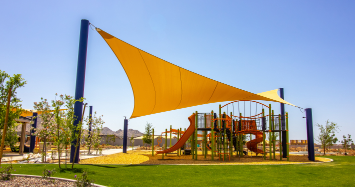 ShadeLA offers a playbook to help city meet shade goals
New policy briefs outline how to streamline processes to increase shade in LA
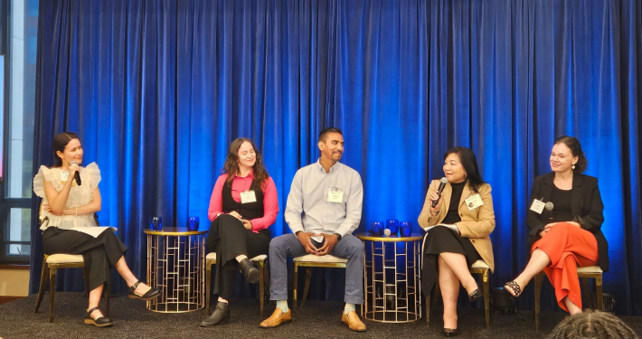 At the Luskin Summit, environmental justice took center stage
From plastic pollution to extreme heat, Luskin Center for Innovation panelists examined community-driven solutions
https://innovation.luskin.ucla.edu/wp-content/uploads/2026/06/TCC-news-story-2026.png
600
1200
angela wu
https://innovation.luskin.ucla.edu/wp-content/uploads/2024/07/web-headers-2024-07.png
angela wu2026-07-07 09:00:212026-07-07 10:01:33Climate communities are healthy communities
https://innovation.luskin.ucla.edu/wp-content/uploads/2024/12/not-used-yellow-shade-sail-playground-iStock-1395445446-scaled.jpg
1707
2560
angela wu
https://innovation.luskin.ucla.edu/wp-content/uploads/2024/07/web-headers-2024-07.png
angela wu2026-06-04 09:21:012026-06-04 09:24:22ShadeLA offers a playbook to help city meet shade goals
https://innovation.luskin.ucla.edu/wp-content/uploads/2026/05/Advancing-Shade-Solutions-During-LAs-Mega-Event-Era-Panel.jpg
1119
2047
angela wu
https://innovation.luskin.ucla.edu/wp-content/uploads/2024/07/web-headers-2024-07.png
angela wu2026-05-22 16:54:432026-05-22 16:55:42At the Luskin Summit, environmental justice took center stage https://innovation.luskin.ucla.edu/wp-content/uploads/2026/05/CHRC-Logo.png
1000
2000
angela wu
https://innovation.luskin.ucla.edu/wp-content/uploads/2024/07/web-headers-2024-07.png
angela wu2026-05-21 09:00:242026-05-21 09:31:38New toolkit helps communities prepare for heat
https://innovation.luskin.ucla.edu/wp-content/uploads/2026/05/CHRC-Logo.png
1000
2000
angela wu
https://innovation.luskin.ucla.edu/wp-content/uploads/2024/07/web-headers-2024-07.png
angela wu2026-05-21 09:00:242026-05-21 09:31:38New toolkit helps communities prepare for heatMEDIA COVERAGE
How cities are fighting back against the ‘heat island effect’ (National Geographic)
Newsom’s stance on controversial data centers about to be tested. Again. (Los Angeles Times)
Managed retreat in Ruidoso could mean more public lands (High Country News)


Stay connected. Get our latest research in your inbox.
PUBLICATIONS
 https://innovation.luskin.ucla.edu/wp-content/uploads/2026/05/GRID-Alternatives-first-install-1-scaled.png
1920
2560
angela wu
https://innovation.luskin.ucla.edu/wp-content/uploads/2024/07/web-headers-2024-07.png
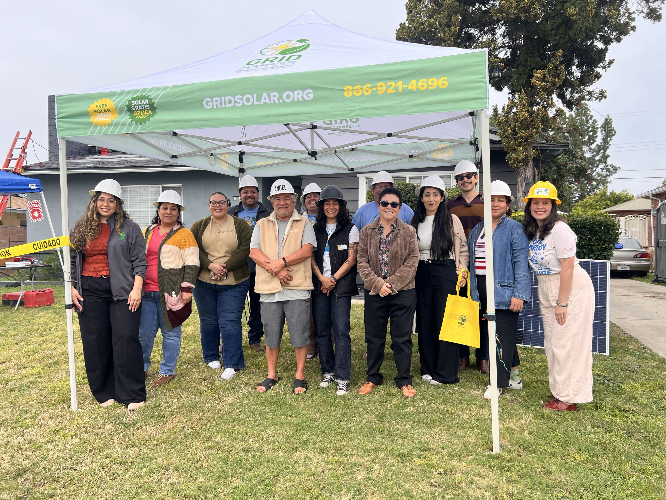
angela wu2026-07-07 11:18:072026-07-07 11:18:07Pomona ACTS 2026 Progress
https://innovation.luskin.ucla.edu/wp-content/uploads/2026/05/GRID-Alternatives-first-install-1-scaled.png
1920
2560
angela wu
https://innovation.luskin.ucla.edu/wp-content/uploads/2024/07/web-headers-2024-07.png
angela wu2026-07-07 11:18:072026-07-07 11:18:07Pomona ACTS 2026 Progress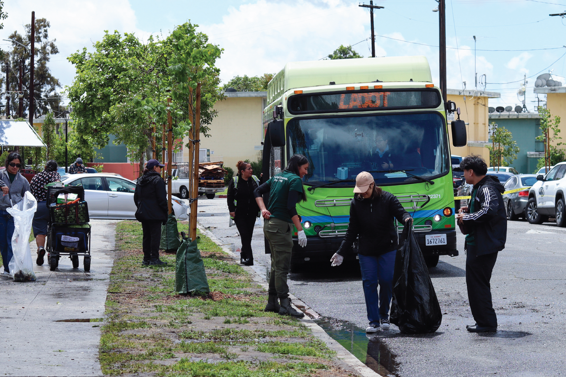 https://innovation.luskin.ucla.edu/wp-content/uploads/2026/06/TCC-Pacoima-Year-6-2026-Featured-e1782416981524.png
1468
1870
angela wu
https://innovation.luskin.ucla.edu/wp-content/uploads/2024/07/web-headers-2024-07.png
angela wu2026-07-07 09:00:252026-07-07 11:25:35Green Together 2026
https://innovation.luskin.ucla.edu/wp-content/uploads/2026/06/TCC-Pacoima-Year-6-2026-Featured-e1782416981524.png
1468
1870
angela wu
https://innovation.luskin.ucla.edu/wp-content/uploads/2024/07/web-headers-2024-07.png
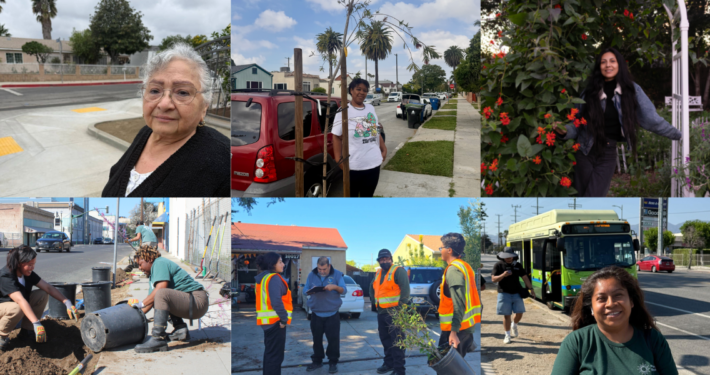
angela wu2026-07-07 09:00:252026-07-07 11:25:35Green Together 2026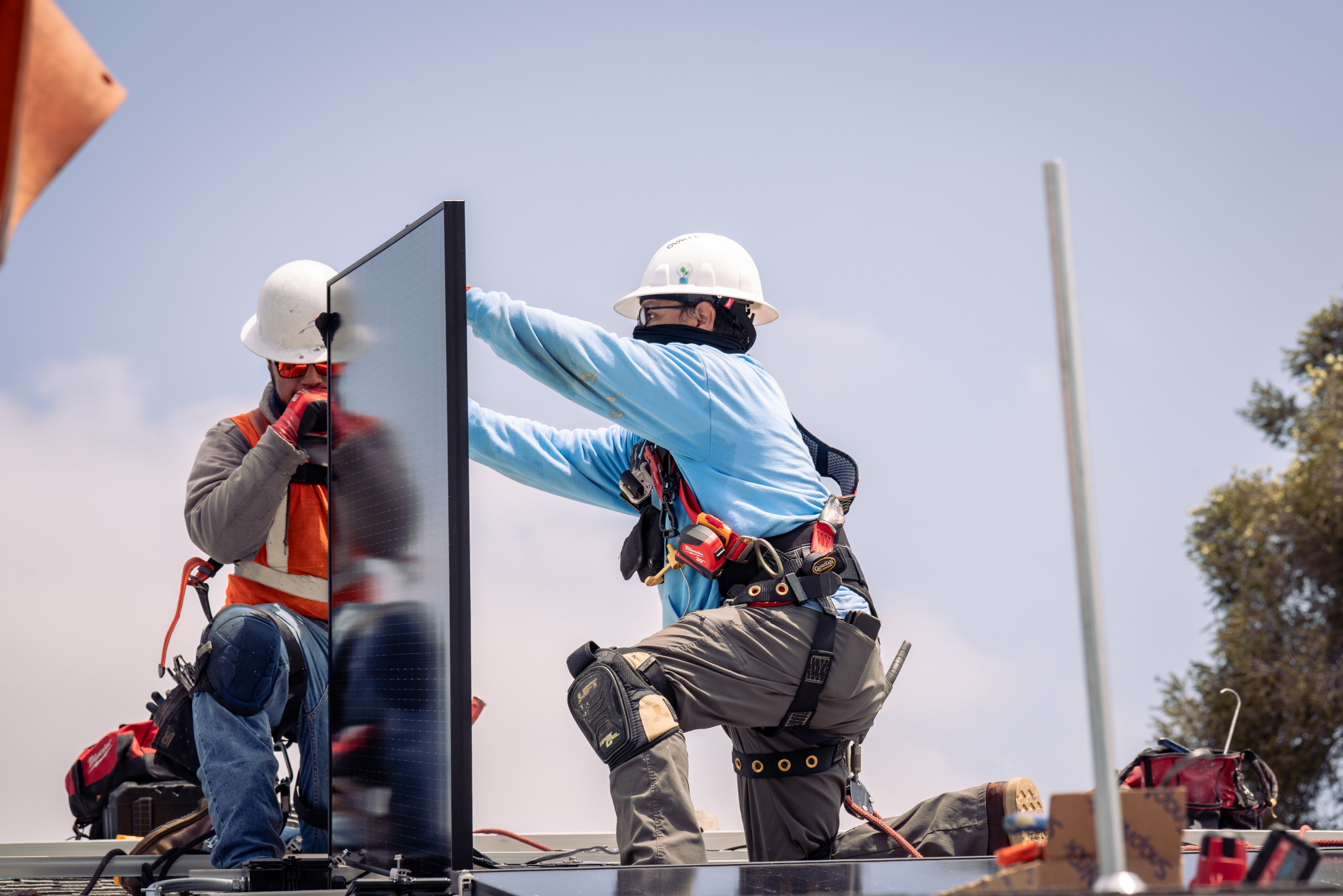 https://innovation.luskin.ucla.edu/wp-content/uploads/2025/07/South-LA-TCC-GRID-Alternatives-scaled.jpg
1708
2560
angela wu
https://innovation.luskin.ucla.edu/wp-content/uploads/2024/07/web-headers-2024-07.png
angela wu2026-07-07 08:00:242026-07-07 11:21:43South LA Eco-Lab 2026 Progress
https://innovation.luskin.ucla.edu/wp-content/uploads/2025/07/South-LA-TCC-GRID-Alternatives-scaled.jpg
1708
2560
angela wu
https://innovation.luskin.ucla.edu/wp-content/uploads/2024/07/web-headers-2024-07.png
angela wu2026-07-07 08:00:242026-07-07 11:21:43South LA Eco-Lab 2026 Progress
Progress Website on Implementation of the Transformative Climate Communities Program Grant
Jul 2026
Progress Report on Implementation of the Transformative Climate Communities Program Grant
Jul 2026
Progress Website on Implementation of the Transformative Climate Communities Program Grant
Jul 2026
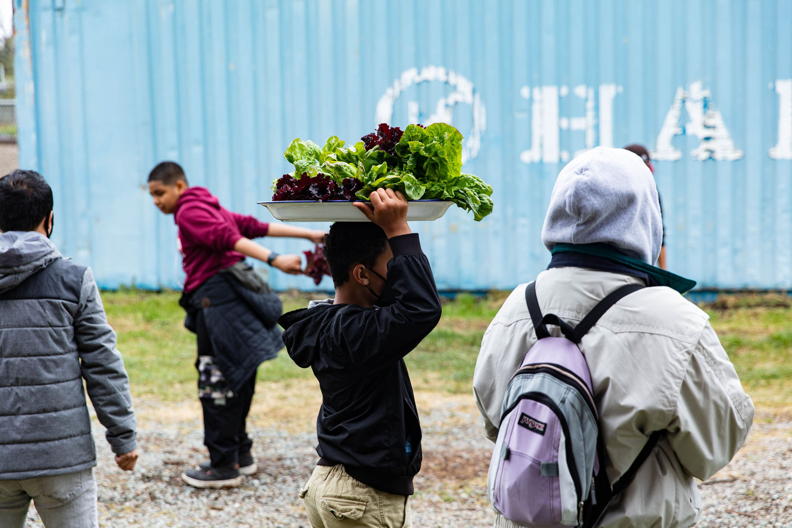
Progress Website on Implementation of the Transformative Climate Communities Program Grant
Jul 2026